The 15 Weirdest Concept Car Interiors In Automotive History
Interiors of modern cars are designed with the customers in mind. They have to be stylish, but at the same time they have to be intuitive and easy to operate. Not so with concept cars, which will only be shown on one or two auto shows and then put into a museum.
Interiors of modern cars are designed with the customers in mind. They have to be stylish, but at the same time they have to be intuitive and easy to operate. Not so with concept cars, which will only be shown on one or two auto shows and then put into a museum. Manufacturers often went wild on their interiors, which often ended up in utter chaos - especially in the 80’s, when computers made their first appearance in cars. So, let’s look back, and count down the 15 weirdest concept car interiors of all time. Enjoy!
NOTE: The images are all really big, so it may take a moment until they load. Feel free to zoom in and have a closer look at the madness…
#15: Citroën Hypnos (2008)
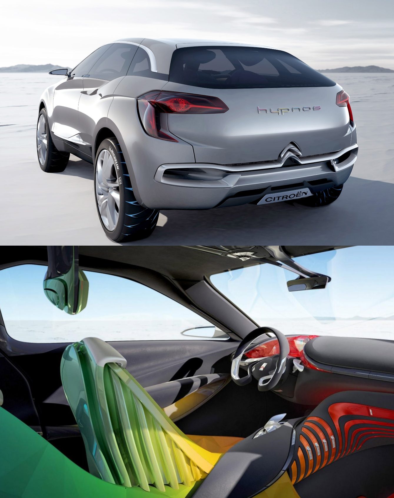
The Citroën Hypnos is one of only two cars in this list that were made after 2000. It’s a mid-size luxury crossover, and some design features of it can be found on the Citroën C4 Aircross. The concept comes with what’s probably the most colorful interior of all times: The gauge cluster is bright red, the front seats are orange-yellow-green, and the rear seats are blue-purplish. The shape of the seats is also pretty weird, with triangles forming the seating surface and slats along the base. Also, the headrests are hanging from the ceiling, which is rather unusual. But the seats are not the only weirdly-shaped things in the interior: From the steering wheel over the pedals to the gear stick - there’s nothing in this car that looks “normal”. A well-deserved spot in this list, but brace yourself, there’s worse stuff to come.
#14: Pontiac Banshee IV (1988)
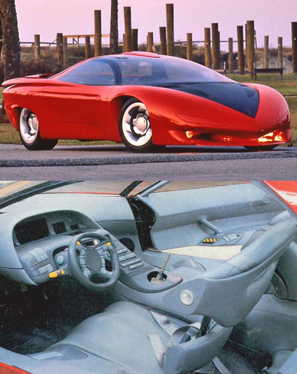
The 4th version of the Pontiac Banshee concept looks great on the outside - futuristic, yet sleek and elegant and with some really nice details like the integrated rear wing. The interior however was slightly weird: It looks like it was entirely made from one big block of cheap gray GM plastic, with four yellow buttons thrown in to add some random color. Sadly, there are no high quality pics available, so we can only assume what all these chunky buttons are for. The designers of this car followed the 80’s concept car trend and crammed as many buttons on the steering wheel as possible - 23 in total! And as said, two of them are yellow - my guess would be that these operate the turn signals, as the yellow-buttoned stock behind the steering wheel only seems to control the wipers or maybe the lights.
The shape of the cockpit is also rather interesting - it slopes around the driver, with the top end giving shade for the four or five displays behind the steering wheel. The interior also wastes an incredible amount of space - there appears to be two square meters of blank plastic below the windscreen, and the armrests on the doors are absolutely ginormous. Speaking of the doors, they come with a little grab handle and some buttons - which are probably used to get out of the car, as there is no traditional door handle in sight. The seats of the car look like they’re from a space shuttle, but one of the weirdest things in the interior has to be the gear stick. It sits in a big hole in the center console, and it’s about 20 centimeters high, which looks extremely out of place.
#13: Buick Questor (1983)
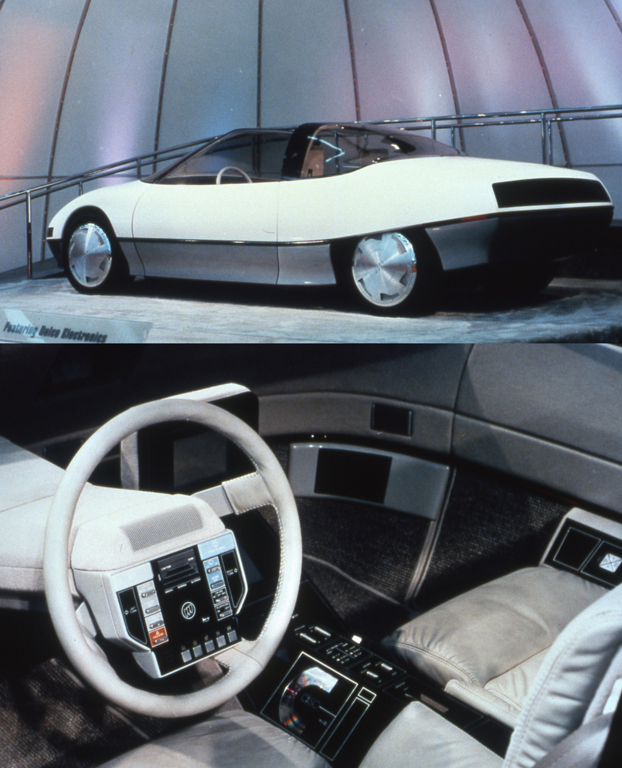
Moving on, we’ve got yet another GM concept car from the 80’s: The Buick Questor. It was released five years before the Banshee, and that means the interior is rather different. The first thing you’ll notice is the weird steering wheel - where modern cars would have an airbag, this thing has got a big control panel. On the picture above it’s pretty hard to read all the switches, so here is a better one that only shows the steering wheel.
Anyways, let me talk you through: On the top sits something which might be a speaker, but just as well an air vent - I’m not sure. But below that is where the madness really starts: On the top left we’ve got the switch for the brights, and on the top right, the “push to wash” switch for the wipers. The wipers are tuned on and off with a small metal switch below that, and another metal switch lets you change their speed. On the far right, there’s a huge button for the turn signal, and so is on the far left. Next to the left turn signal button sits the control unit for the lights, which again let’s you turn them off or either enable the parking or the headlights. Below that, you can turn on the interior lights and the hazards, whereas on the right side, these switches control the telephone and the cruise control.
In the center of the steering wheel sits the horn with the Buick logo on it, and above that is a weird diagram saying “Caution Zone”, which probably tells you how fast you can go on “Gravel”, “Normal” and “Slippery” road surfaces. On the far bottom side of the wheel sits the ignition and the gearbox control. That’s it for the steering wheel, but the quirks don’t end there: The center console comes with two displays for radio and navigation, and below that sits a CD player and some more metal buttons which I couldn’t figure out what they do.
#12: Nissan NRV-II (1983)
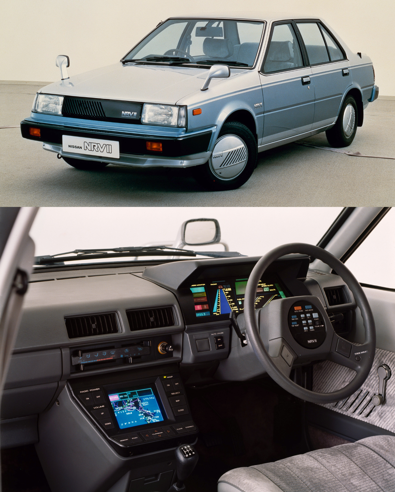
At first glance, the interior of the Nissan NRV-II may not seem too weird. It’s got a digital gauge cluster, a multifunctional steering wheel, and a satnav in the center console - pretty much all the stuff you’d get in a modern-day car. What you’ve got to keep in mind though is that this car is 34 years old! Just remember (or look up) how big an average IBM PC was back then - how the hell did Nissan manage to cram all this into a car? This car is probably Doug DeMuro’s wet dream - all this quirky tech and randomly placed buttons! For example, this car has got a radar system that measures the distance to the car in front. Standard feature of many new cars, but innovative as hell in 1983!
Also, the NRV-II has got the power button on the steering wheel - just like in a modern-day Ferrari! There is also a tiny “voice input” button on the steering wheel - this must have been so futuristic back then! This car even comes with cruise control - and three buttons to operate it: There’s one orange button on the steering wheel that says “auto cruise” - and two behind the steering wheel that say auto cruise “on” or “off”, for whatever reason. There are more weird buttons: Radio power: On or off! Map: On or off!
But one of the craziest things about that mid-1980’s infotainment system has got to be the volume control. There is one dial on the steering wheel that let’s you control it, but there are also two separate buttons next to the center console screen that say “up” and “down”. What’s even more confusing is that the “Volume up”-button is about five times as big as the engine start button…
#11: Citroën Karin (1980)
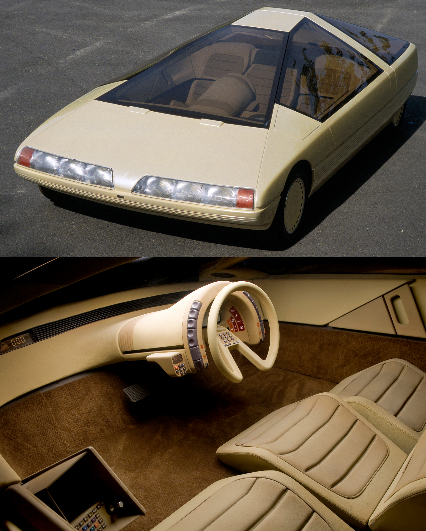
Citroën is known for making weird concept cars, and the Karin is definitely one of the weirdest. It is entirely beige, on the outside as well as on the inside, and it’s a three-seater car shaped like a pyramid. And as if that wasn’t yet crazy enough, Citroën has fitted it with one of the oddest car interiors of all time.
So, as said, it is a three seater car, and just like in the McLaren F1, the driver sits in the middle and further forward than the two passengers. Accordingly, the steering column sticks out of the middle of the dashboard, and as the car doesn’t have a center console, all important controls were mounted on it. First of all, on both sides of the outer edge of the circular steering column are six switches and two scroll wheels. I sadly couldn’t determine what they are used for. Then, on the steering wheel (which of course only has one spoke, Citroën tradition) sits something that looks like the number pad of a keyboard, with two extra buttons beneath and a speaker above it.
Behind the steering wheel is a digital gauge cluster, and its tiny display looks hilarious if you’re used to the new Audi ones. The display is surrounded by loads of warning lights (very important feature in a Citroën). On the left and right side of the steering column are mounted two extra control panels. One of them is for the radio, but I don’t know what exactly the other one does. There is also a little box with even more switches in the left passenger’s foot well, so apparently Citroën didn’t manage to mount all switches on the steering column. Guess how this car would have looked with one the button-flooded steering wheels you’re about to see. By the way, as this car is pyramid-shaped, the triangular door handles are not much of a surprise…
#10: Volkswagen Orbit (1986)
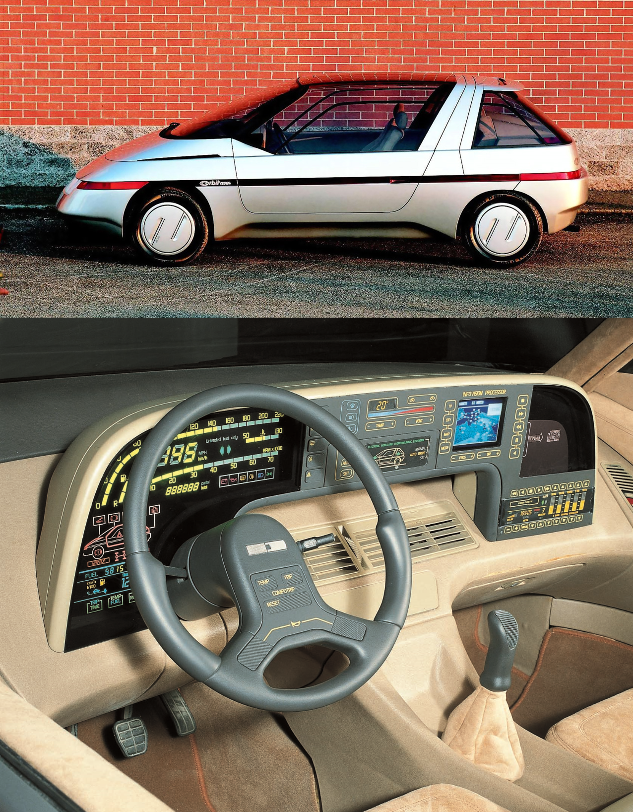
One of the few German cars on this list is the 1986 Volkswagen Orbit Concept, and it has one of the most complex digital gauge clusters of all time. It sits on top of the actual dashboard which only contains the air vents, and it has some pretty unique features.
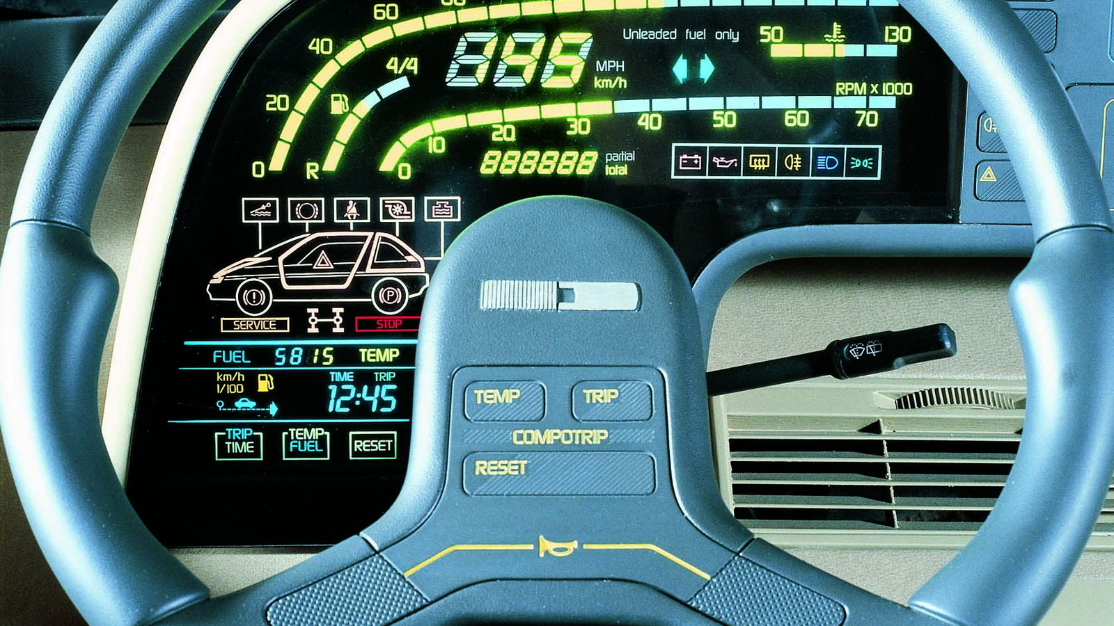
Let’s start on the left, where we’ve got some digital gauges for time, trip time, temperature and fuel. Pretty standard nowadays, but keep in mind this car is over 30 years old. Above that, we’ve got a diagram of the car, which shows open doors and technical problems. Behind the oddly-shaped steering wheel (which comes with three buttons for the “Compotrip”, labeled “temp”, “trip” and “reset”) sits one of the highlights: Digital beams that run along some dials to show the speed (in both MPH and km/h), RPMs, cooling water temperature and amount of fuel. And they all glow neon yellow. If you want to see a more detailed picture of this madness, scroll back up to the thumbnail of this post.
Moving on, we’ve got the climate controls, which are pretty straight forward, but of course digital and operated using touch-sensitive buttons. Below that, we’ve got yet another diagram of the car which controls the “Electronic Modulated Hydropneumatic Suspension” (or something like that, it’s pretty hard to read). Next to that sits the so-called “Infovision Processor”, which controls the satnav and TV. On the far right side, there is a huge CD player, and below that, we’ve got the controls for the radio, including an equalizer. The radio unit alone comes with 20 touch-sensitive buttons - compare that to the boring interiors of current Volkswagens! Definitely a well-deserved spot on this list!
#9: Pontiac Pursuit (1987)
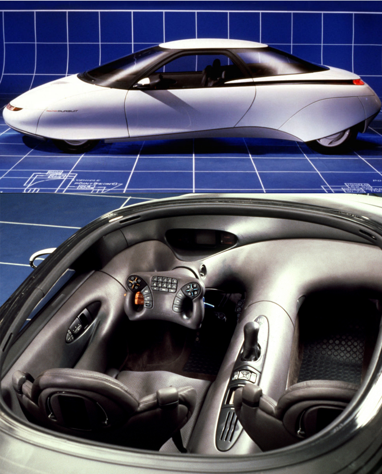
The Pontiac Pursuit is yet another GM concept car and was released a year before the Banshee IV. Still, its interior is even crazier. It also looks like it was carved out from a big block of GM plastic, and it also has a hell lot of buttons on the steering wheel - 29, to be exact. Again, you can find a better picture of it here.
Speaking of the steering wheel: It looks like it came straight from a fighter jet. Behind the fancy steering wheel are even more buttons for the wipers and the lights - the buttons on the left are orange, the ones on the right are blue. Very creative, Pontiac. Above the steering wheel sits a digital gauge cluster, which comes with all the fancy computer graphics you’d expect from a 1980’s concept car.
The rest of the interior is… well… pretty much empty. There are no buttons on the huge center console apart from a little control panel behind the gear stick, which again seems weirdly out of place because it sticks out so much. The seats are also pretty funky, they probably came from the same fighter yet which Pontiac stole the steering wheel from.
#8: Lancia Orca (1982)
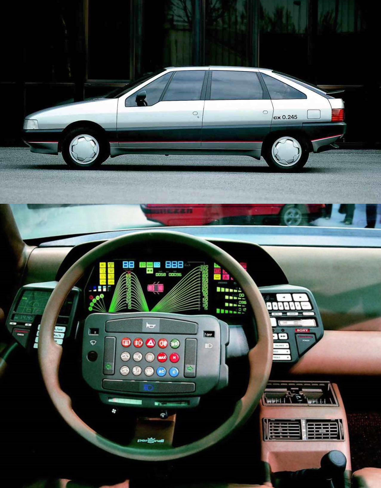
Lancia, oh Lancia. You will see many of them on this list. Kicking it off is the 1982 Orca Concept, an aerodynamic sedan. It looks kinda cool (and ahead of its time) on the outside, but the interior is a mess.
Let’s start with the steering wheel, which contains the buttons for the lights, turn signals, air conditioning and wipers. The buttons are of course of various shapes and colors, but even more colorful is the digital gauge cluster. It looks extremely complex (and impractical) with the glowing bars that indicate the speed and RPMs. Luckily, above these fancy diagrams, there are two normal digital gauges that show exactly the same information. They are surrounded by warning lights and yet another diagram that shows which doors are open.
On the left sits another diagram that shows which gear you’re in, and on the right are four more fancy diagrams which I couldn’t figure out what they display. I guess they have something to do with the Sony radio unit which sits to the right of the gauge cluster. On the opposite site sits another control unit with a built-in display, but sadly I can’t tell what it’s used for. Still, this has to be one of the most overwhelming interiors of all time.
#7: Renault Ondelios (2008)
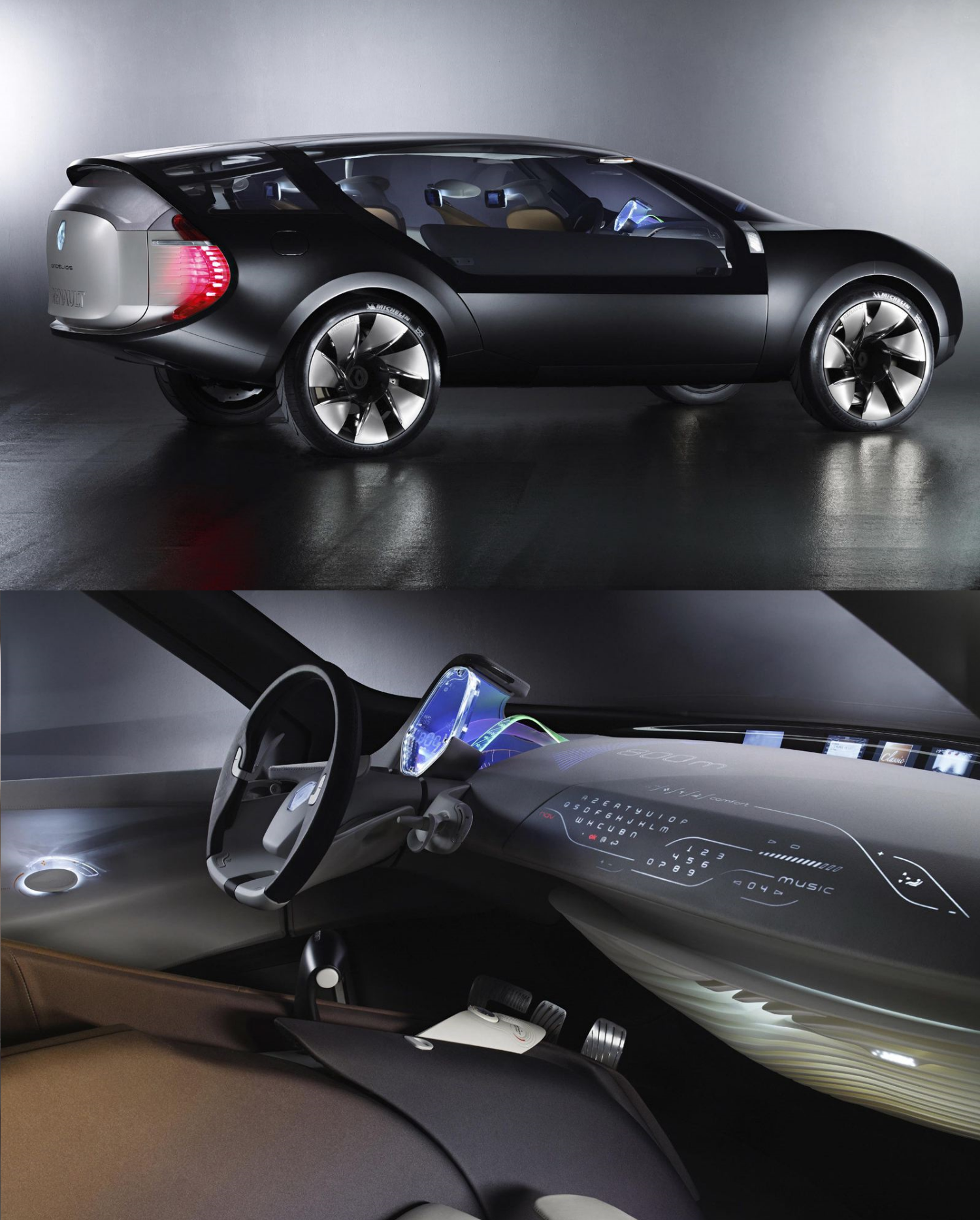
The second (and last) car in this list produced after 2000. Ironically, it’s again from 2008, it’s again a French car, and it’s again a SUV concept. This time, we’re talking about the Renault Ondelios, which luckily never went into production. It looks really strange on the outside, and the interior is even crazier.
Let’s start with the gauge cluster. It sticks out behind the (also weird looking) steering wheel, and it’s transparent. Because, why not. It is surrounded by the leather dashboard, but there’s a gap on the right side. From this gap emerges a wave of glas, which again displays some information. In the headliner sits a projector that beams instructions of the satnav onto the big dashboard, and at the far end of said huge dashboard sits a curved screen that shows additional information.
But the craziest thing about this car has got to be the keyboard. Yes, the keyboard. It is used to control the essential features of the car, and it’s integrated into the leather dashboard. Sure, it looks cool, but using that every day would be impractical as hell.
#6: Lancia Medusa (1980)
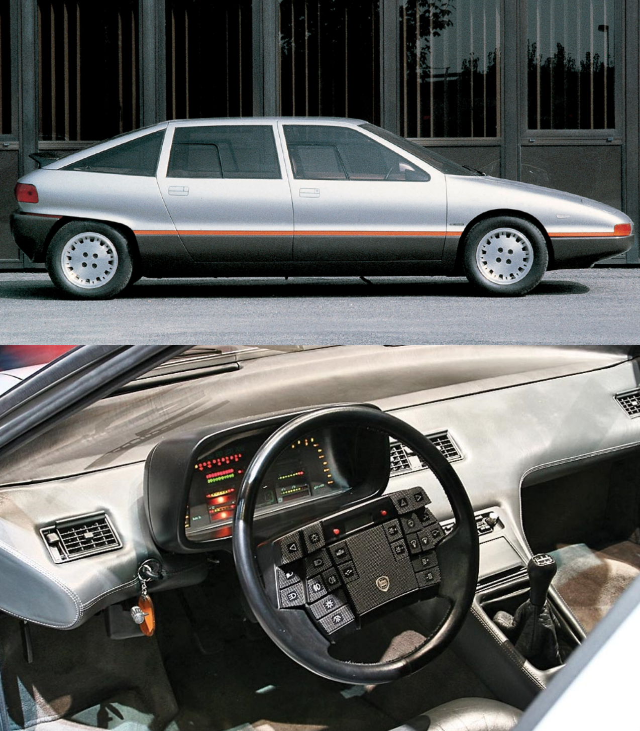
Moving on, we’ve got yet another streamline sedan Lancia, although this time, it’s two years older. What does that mean for the interior? Yes, it’s an even bigger mess. Let’s start with the steering wheel, and again, if you want to admire this thing in better quality, click here.
It is dominated by 25 buttons, which are all of different sizes and heights, and make the steering wheel look extremely uneven. Also, the buttons are all wrapped in carbon fiber skins, which looks rather out of place on this car. The buttons control the wipers, lights, hazards and the air conditioning as well as the digital clock on the top of the steering wheel. Behind the steering wheel sits the gauge cluster, which is far less complex than the one on the Orca. It doesn’t yet consist of a computer screen, but instead 3 trillion LED’s show all the important information.
Fun fact: This car still has a keyhole, and like in a Porsche, it sits on the left.
#5: Lancia Sibilo (1978)
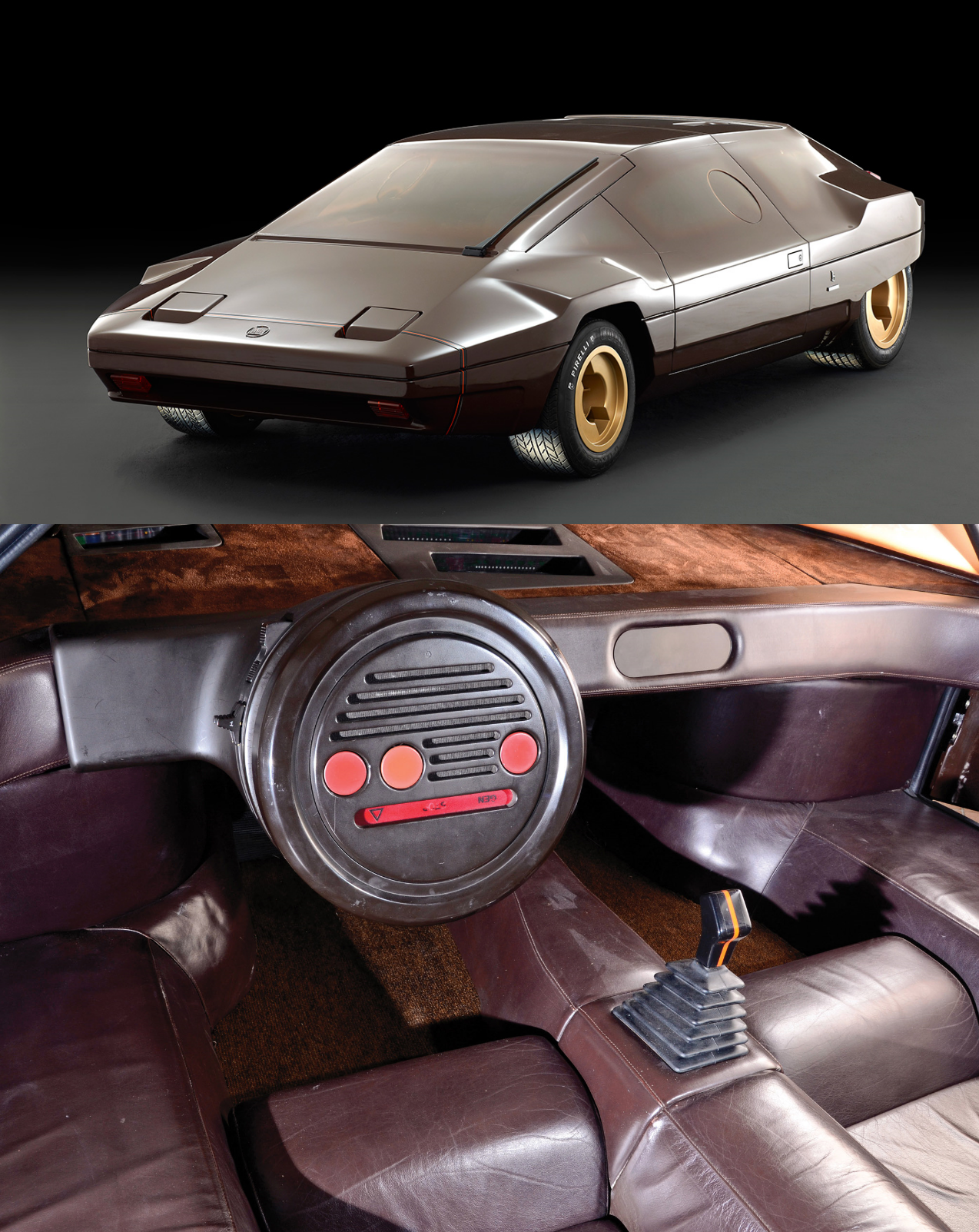
Now, we’ve seen all these button-flooded, crammed interiors - but what on earth is that?! This is the interior of Bertone’s Lancia Sibilo Concept, which was based on a production Stratos. And while the exterior looks stunning, it seems like Bertone ran out of ideas when it came to the interior.
It is made from brown plastic, purple leather and light brown carpet, and it looks like it came straight from a toy car with very few details. The steering wheel has no spokes or cutouts whatsoever. It’s just a round thing, with three buttons for the warning lights and a speaker on it. All the instruments are placed high up on the dashboard, for distracting the driver’s eyes as little as possible from the road. Okay, that makes sense, but still, the interior just looks sh*t. And that’s why it’s on this list.
#4: Lancia Stratos Zero (1970)
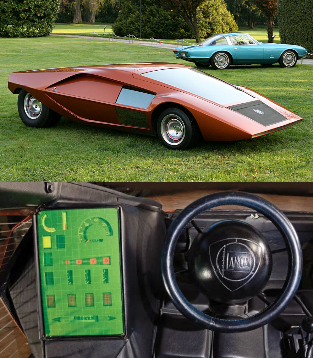
Next up, we’ve got YET ANOTHER Lancia (it’s the last one, I promise!) and also the oldest car on this list. It was designed by the genius Marcello Gandini (the head designer at Bertone) almost 50 years ago, and it still looks futuristic. Just imagine how ahead of its time this thing must have been in 1970! But not only the design was ahead of its time, the interior was as well.
You thought Tesla came up with the idea of having a huge vertical instrument panel? Nope, this concept already had that half a century ago. Apart from that masterpiece of technology there’s not much to say about the interior. The steering wheel has got a really big circular middle part, probably as crash protection. The seats are almost horizontal, and you can get in by lifting up the windscreen. With only 33 inches in height, there wasn’t any room for doors. The prototype is fully working, but it’s only powered by a Lancia V4 engine with 115 hp. The concept was restored in 2000, and got sold in 2011 for $915,000.
#3: Mercedes-Benz F200 "Imagination" (1996)
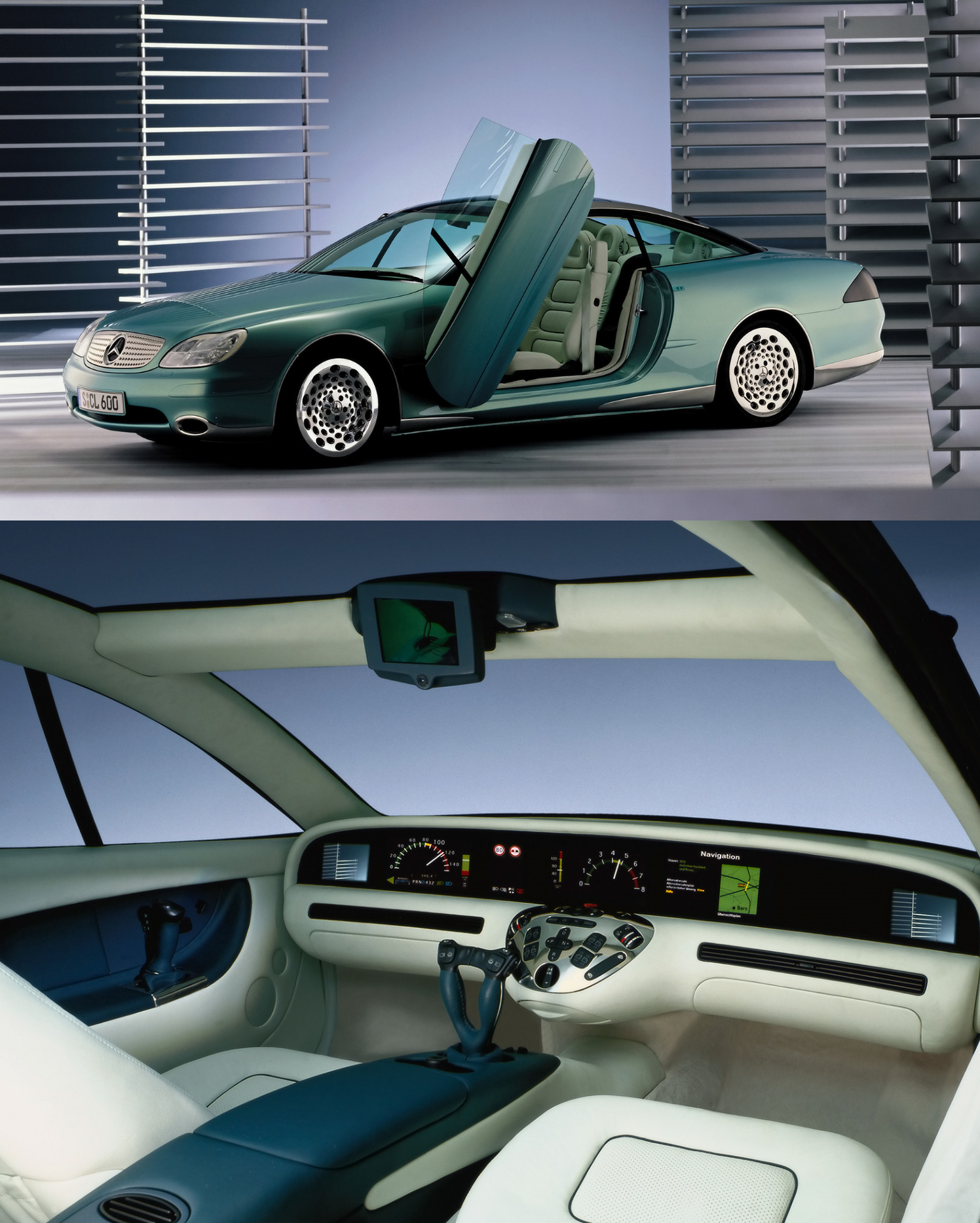
The Mercedes F-Series has brought out some amazing concept cars, but the F200 Imagination is still one of the coolest. When looking at the interior, the first thing you’ll notice is that there’s no steering wheel and no pedals. “Is this an autonomous car?”, you may ask yourself, but then you’ll probably notice the joysticks mounted on the center console and the doors. Yep, that’s how you control this car.
The lack of a steering wheel meant that a big displays could be fitted into the dashboard. Apart from standard gauges like the speedometer and the rev counter, this car comes with rear-view cameras on the far left and right sides of the display, as well as a satnav and traffic sign recognition. Ironically, when you have a closer look at the image above, you can see that the top speed is 80 km/h and the car is going 120. Of course it is actually standing on a stage, but this still seems like a big fail. Below the huge display is a chrome control panel for the heaters, windows, lights and hazards, and it looks like one of the most impractical center consoles ever, mainly because it’s shaped like a sphere.
#2: Oldsmobile Incas (1986)
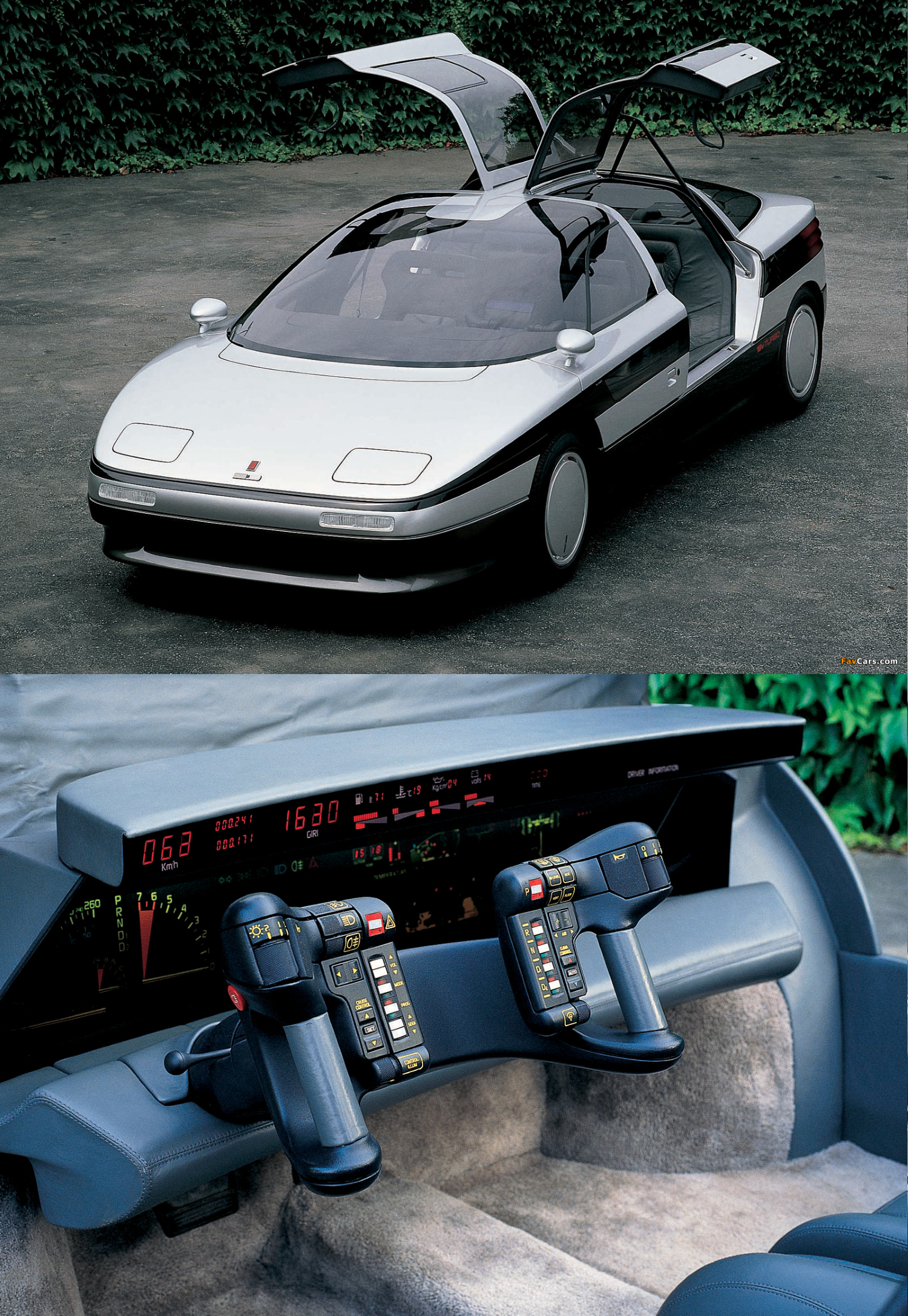
The last American car on this list is the 1986 Olds Incas, an aerodynamic sedan with gullwing doors. And an interior that strongly reminds of K.I.T.T. from Knight Rider. First of all, the steering wheel which looks even more fighter-jet-ish than the one from the Pontiac Pursuit. It has around 40 buttons on it, but many of them have various functions. They control the gearbox, the radio, the cruise control. the lights, the wipers - everything. And by everything, I legit mean everything. There are no other buttons in the interior.
The entire dashboard consists of some huge spaceship-like screens. I’m not even going to try listing all the stuff they display, just have a look for yourself and try figuring out what they do… Anyways, this car has a well-deserved podium spot on this list.
And now, it’s time for the Number 1.
#1: Maserati Boomerang (1972)
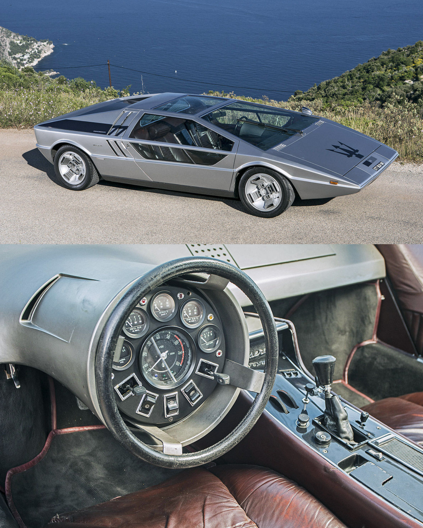
The top spot goes to another 1970’s Italian wedge-shaped supercar, the Maserati Boomerang. Designed by legendary Giorgetto Giugiaro, this car still looks futuristic today. At least on the outside, because well, the interior is a mess. It’s pretty obvious why this car made it on the top spot of this list - the steering wheel and gauge cluster are part of a single console that emerges from the dash, and the steering wheel rotates around the stationary gauges. In total, the console houses six gauges, three switches and two levers - and the steering wheel rotates around all that. What an idea.
Also, there’s no speedometer, the gauges only show the RPMs, the fuel, oil pressure, water temperature and battery. In the center console sit some unlabeled buttons and dials as well as the keyhole and the transmission lever, but that’s of course all secondary stuff. Anyways, a well-deserved 1st place in this list!
So guys, I hope you enjoyed this post. It took me so long to to find high-quality images, to edit them together, and most importantly, to write all this… About six or seven hours in total. So, I would be really glad if you could show some love.
Which one do you think was the craziest? And which ones did I forget? I know there are far more weird concept car interiors, but if I had featured all of them, this (already way too long) post would have been at least three times longer…
Tobi aka The Stig’s German Cousin
Comments
MattKimberley MattRobinson
Awesome article! I really enjoyed it! :D I always love these weird concept cars…because in concept cars world there are no bundaries, just pure imagination
In the 80s: “aw yeah let’s put this awesome digital display and a wild interior and a steering wheel shaped like a banana, and the key in the roof!
Today:
totally LOVE the Maserati Boomerang’s interior!
A lot of these where lanicas
Yo this was amazing and funny to read, well done man.
Weird how Pontiac March iv isnt a concept
Look at its dash
Errrmmm…BRAIN MELTED
That Citroen interior made me commit suicide. Twice.
That nissan…all that tech and it still has manual winding windows…
Pagination