The Digital Dash Is The Only Thing That Infuriates Me About ‘My’ Golf GTI
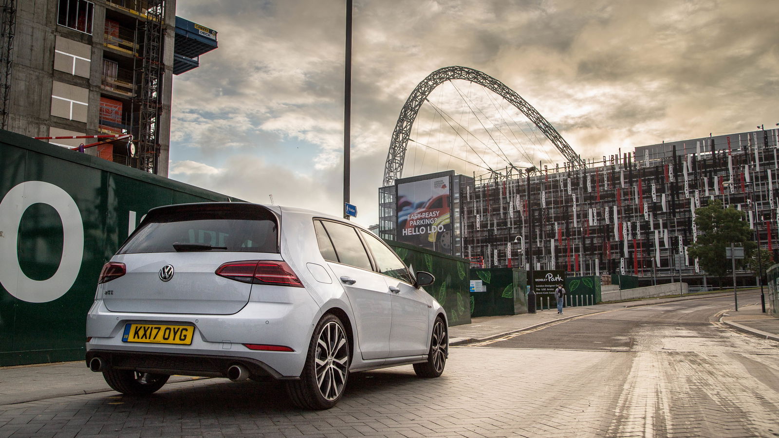
What all Golfs - GTI or otherwise - do better than almost any other car is exude a feeling of familiarity. Everything’s properly thought out. Everything’s where it should be. It all makes perfect sense.
Having a Golf as a long-term test car - as I have done since December last year, starting with a GTI Clubsport - highlights the inadequacies or other manufacturer’s interior design efforts. So it’s a shame then, that there’s one particularly conspicuous fly in the ointment when it comes to the current ‘Mk7.5’ car: Active Info Display.
It’s best thought of as VW’s version of Audi’s Virtual Cockpit, and it replaces the physical dials with a 12.3-inch screen. It’s standard on all UK-spec GTIs and on some other trim levels, while optional on everything else. But it’s nothing like as good as the Audi unit.
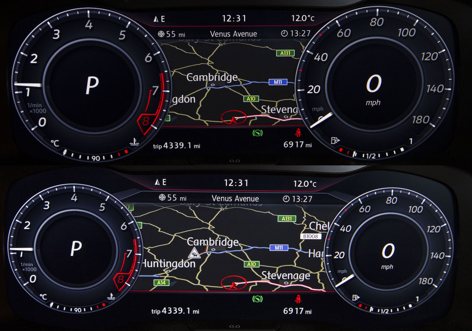
I’ll get my most petty complaint out of the way: the italicised gear indicator and speed readouts are in a font that doesn’t match anything else in the car. And it looks naff. It’s like they’re deliberately trying to irk my near-compulsive love of uniformity.
The physical dials on the Clubsport we had on test looked far better, but I suppose you’re probably thinking it’s worth the sacrifice, since you’ll be able to zoom the dials out and have a really cool, vast map display, right? Well no, actually.
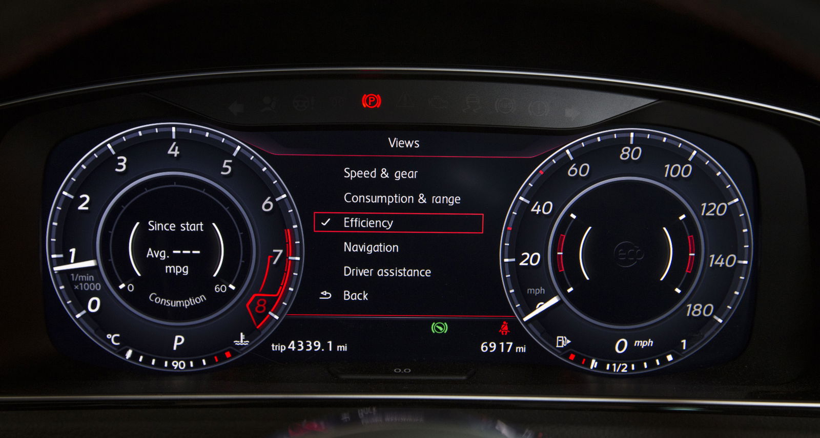
You can zoom the dials out a small amount, maybe giving you about two or so centimetres more map to enjoy. Is there any point in having the digital dials at all, unless bunging all the eco info in the middle of them is appealing to you?
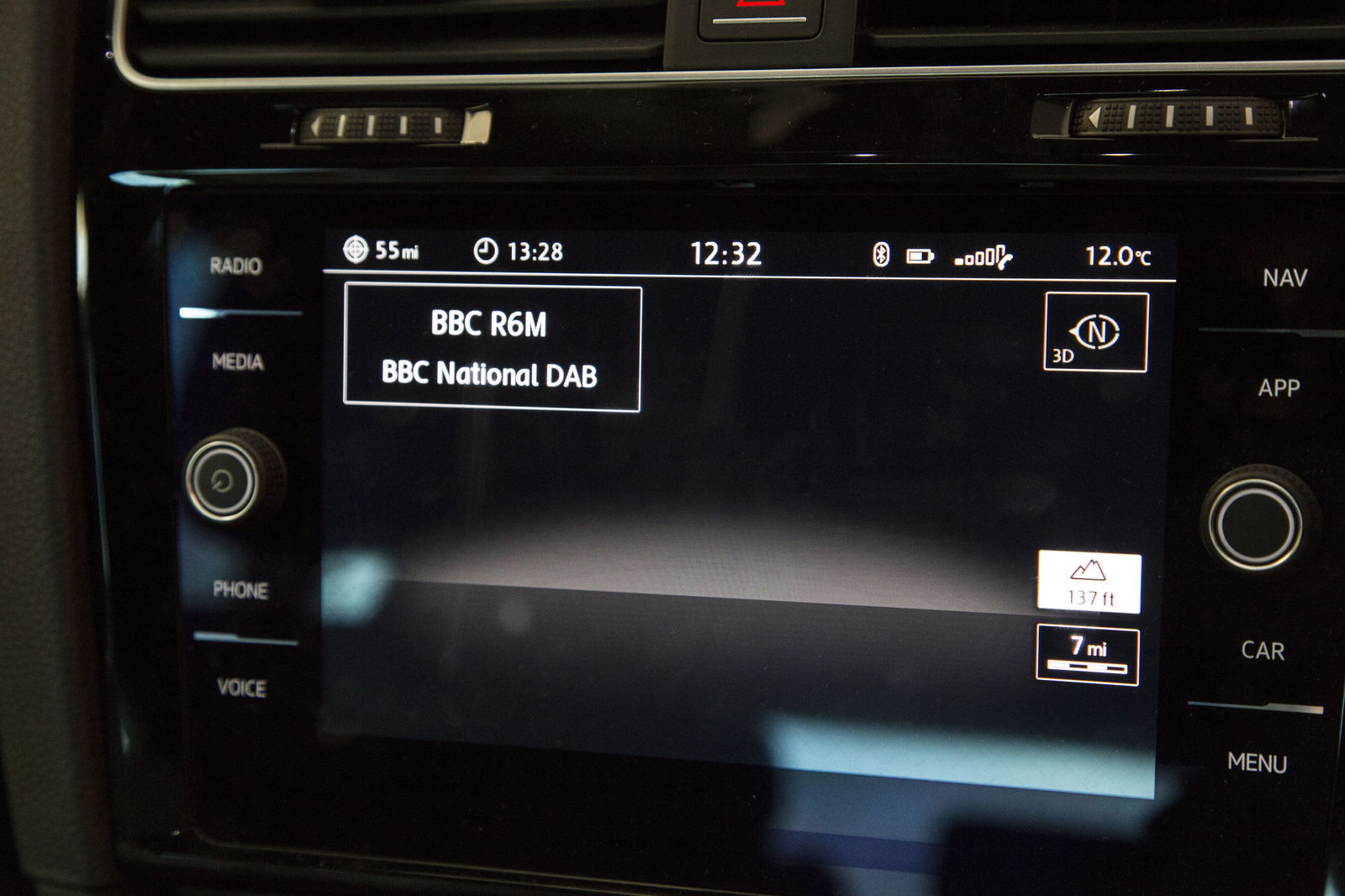
It gets worse, as if you have the base-spec Discover infotainment system like we have, you can’t have the map on both that and the instrument binnacle. It simply won’t let you. Switch the map view to Active Info Display, and the infotainment screen goes almost completely blank, apart from a sad little compass in one corner and a few other bits (below).
It’s as though it’s been artificially hamstrung for the sole purpose of making the optional ‘Discover Pro’ look a bit better. The Pro system is indeed better and not just for that reason, but VW has felt the need to add a gesture control system, which feels like a massive gimmick that doesn’t work all that well. But that’s another rant for another time.
Should you decide to pop the map into Active Info Display on the non-Pro system, you then lose all visual instructions. If you turn the audio announcements off as I do (I don’t want anything interrupting Taylor Swift, obviously), all you have to go on is the little highlighted line on the screen, like you’re using an in-built sat nav circa 2003.
Yes, you can put nav instructions in the middle of the speedometer along with distance remaining on the rev counter, but you lose the big, clear speed and gear indicator displays in the process. And since this is a GTI, chances are you’re going to want that info conspicuously shown.
It might sound like I’m being overly-harsh about all this, but that’s only because of the car it’s in. VW should be better than this, and in fact it is - the newer Active Info Display II system optionally fitted to the MkVI Polo is far, far better. It has much more flexibility and functionality, and if you want, you swap the dials for something else or even make them disappear entirely, replaced by a digital speed readout along the bottom of the screen.
It’s the system that Active Info should have been from the start, and we’re now in a curious situation where it’s available on the lesser Polo and not the Golf. Nor the Arteon, come to think of it. Here’s hoping it makes its way to the rest of the range soon. Stick it in a Golf GTI, and I really will have nothing to moan about…


Comments
The only thing annoying about a Golf is that I can’t play Golf in it.
The most annoying thing about a golf for me is the windows are thin enough for the commoners to break in.
DAB
IMHO, nothing beats the old red and blue Volkswagen dash.
I much prefer the virtual cockpit in our E Klasse
uhhh, check the subtitle except
Too much electronics for the sake of it in modern cars. What’s wrong with regular dials?
Only that thing makes me happy.. NOTING ELSE xD
In all honesty, I just much prefer actual gauges over a digital dashboard
Why there’s no “Check Engine Light”?
Pagination