The New Audi A1 Has Been Leaked And It's All Angular

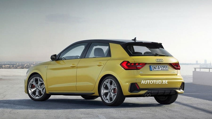
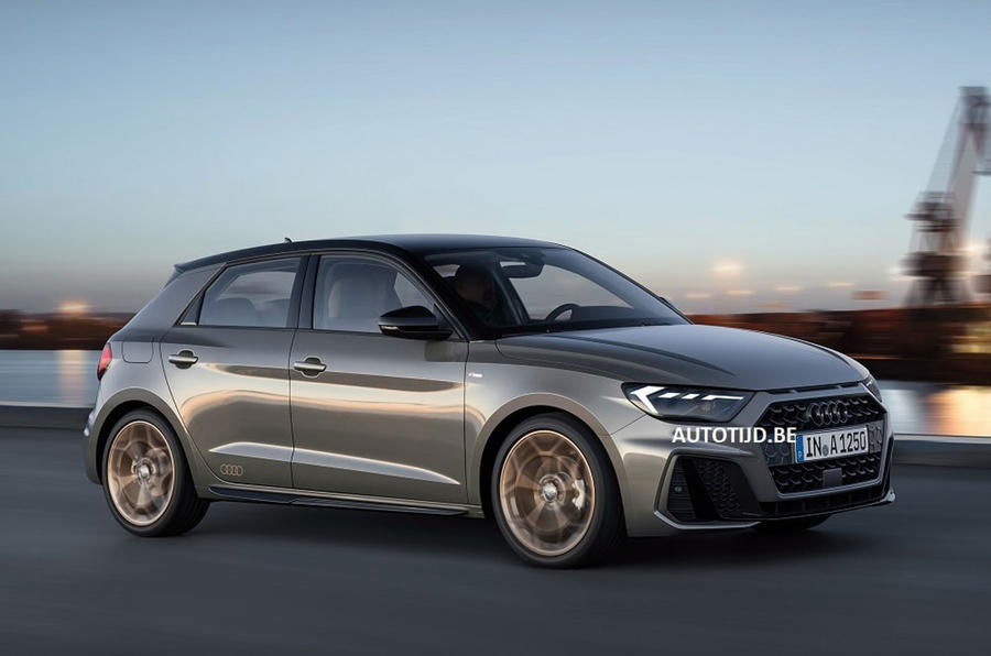
Say hello to the new, more aggressive Audi A1, here early thanks to substantial image leak. First published by a Belgian car site, the decent quality images show the new Ingolstadt supermini from all angles.
First impressions? Audi seems to have creased all the things. Not that we mind - the A1 has always been a rather inoffensive, anonymous thing, but this new one has a nicely striking aesthetic.

The front end is dominated by a massive grille (because of course it is) flanked by sizeable vents. The most distinctive element though is arguably the Sport Quattro-esque slats just above the grille. They’re either a nice touch or a shameless appropriation of Audi’s history - we’ll let you debate that one in the comments.
There are yet more angles at the back, along with some vents on either side of the rear bumper which we’d put money on being fake. The rear shot also shows that the roof can be colour-coded, as it can be on the current A1.

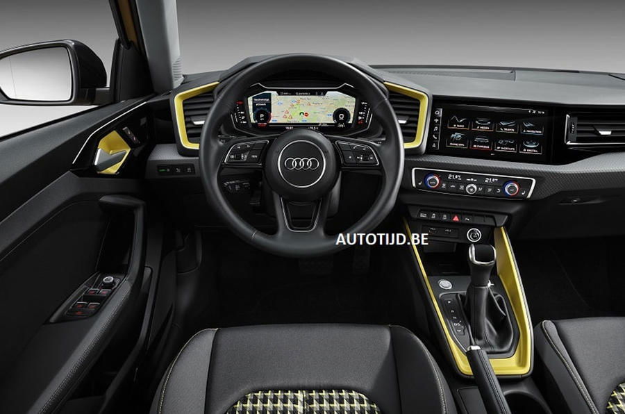
On the inside, the tiny flip-up infotainment system has been ditched. In its place is a huge MMI touchscreen, working in conjunction with a virtual cockpit display which replaces the manual dials. There look to be plenty of colour-coding options in the cabin too.

The car will be based on VW Group’s new MQB A0 architecture, and is expected to share much of its engine line-up with its VW Polo and Seat Ibiza platform mates. Think 1.0-litre inline-threes and 1.5-litre TSI ‘Evo’ lumps in various states of tune. There should also be a four-wheel drive, considerably more powerful ‘S1’ arriving at some point.
No prizes for guessing the one we’re looking forward to most…


Comments
Hyundai called, they want the i20 back!
Why does it look like a bee?
The front looks kinda ok but the side looks like a standard skoda fabia vw polo seat ibiza and the rear doesnt look good at all
Hmm, I wonder where this idea came from…
All I can see is hate from the comment section, it’s like the new Honda Civic reloaded. You guys need to understand that designing something isn’t easy especially in the automotive industry where you already have a lots of designs, and to make it look completely different, you would have to design a spaceship. Just my 2 cents from a graphical, and artist standpoint.
Nice disguise Polo, but we still see you
One good looking car
TBH I find it good looking
Just 👌
Sir, would you like some hummus to take off some of the edge?
I like it, it’s not super boring looking like most of the cars these days
Pagination