Spot The Difference: This Is Lamborghini’s ‘New’ Logo

Lots of car companies have been updating their logos lately in an effort to look sleek, crisp and modern in our increasingly tech-focused world. Some, like Volkswagen and Nissan, have just made things a little more minimalist and monochrome. Others, such as Fiat and Citroen, have looked to their heritage. Others have gone for a more drastic change still – see Peugeot.
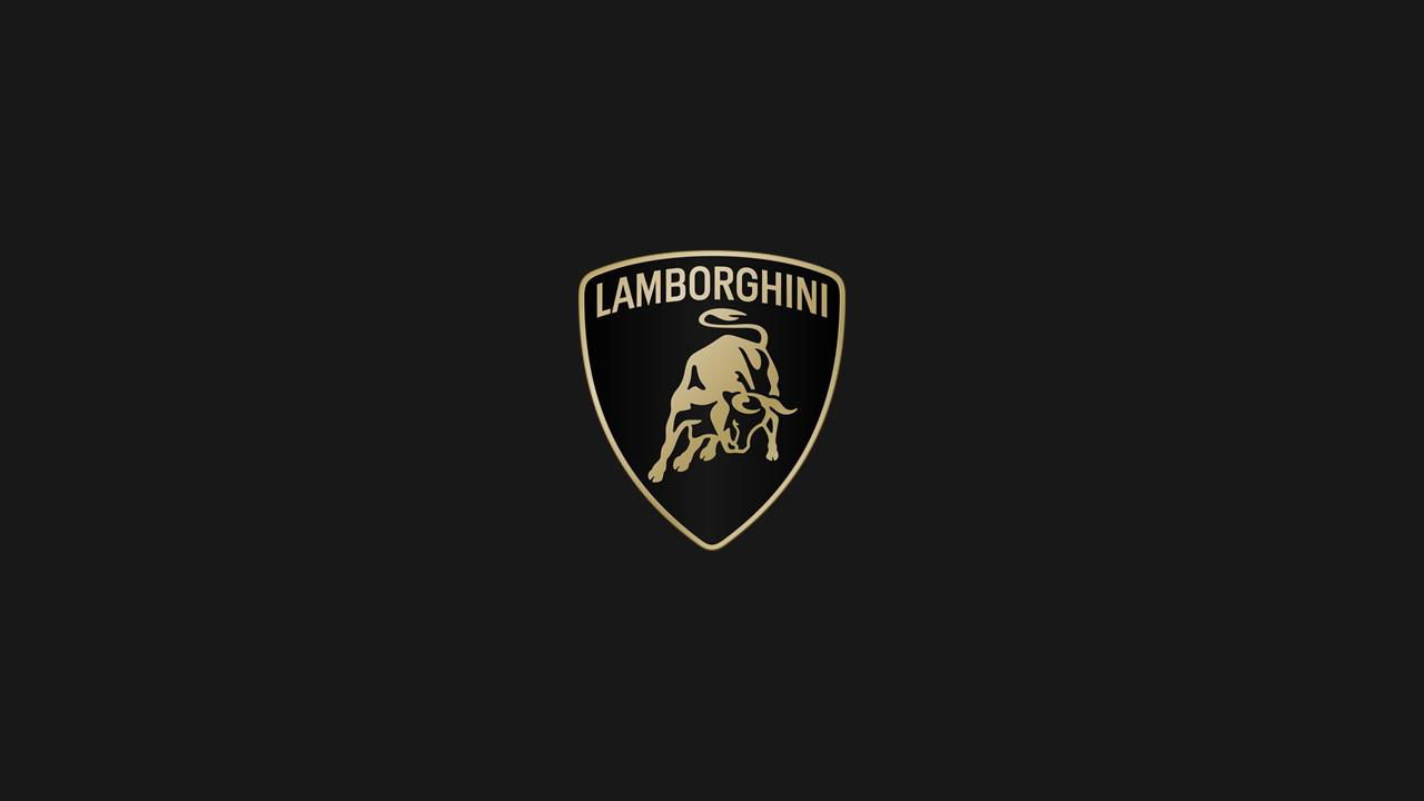
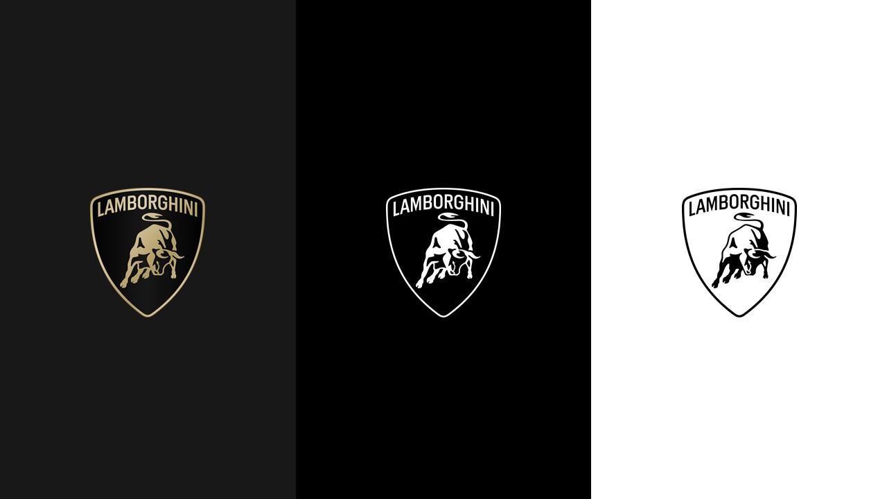
Now, Lamborghini has gotten in on the act, although truthfully, we’re struggling to see why they bothered. Versus the old logo, it gets a slightly different typeface, while the shield and the bull have been given a more minimalist, less detailed treatment. It also swaps the rich, bright yellowy-gold colour for a more muted tone, and loses some of the shine that was incorporated into the old version. And that’s about it.
The new look is apparently in line with the brand’s “brave”, “unexpected” and “authentic” values. Alrighty then. As part of the overhaul of its visual identity, Lambo has also created its own typeface and iconography to be used across all its corporate communications. The company’s digital footprint now features the irritated cow by itself, separated from the shield.
To be fair to Lambo, we can’t blame it for not fixing what ain’t broke: its raging bull logo, a nod to founder Ferruccio Lamborghini’s Taurus star sign, is one of the automotive world’s most instantly recognisable and evocative symbols, up there with the prancing horse of its neighbours in Maranello.

It’s this connection that’s also led to the vast majority of Lamborghinis being named after famous Spanish fighting bulls, something that CEO Stephan Winkelmann recently admitted to Road & Track the company is running out of.
The new logo is already in use across Lamborghini’s online channels, and will soon appear on the company’s cars, presumably beginning with the upcoming Urus hybrid and Huracan successor.


Comments