Take A Closer Look At The New Mercedes S-Class' Giant Screen
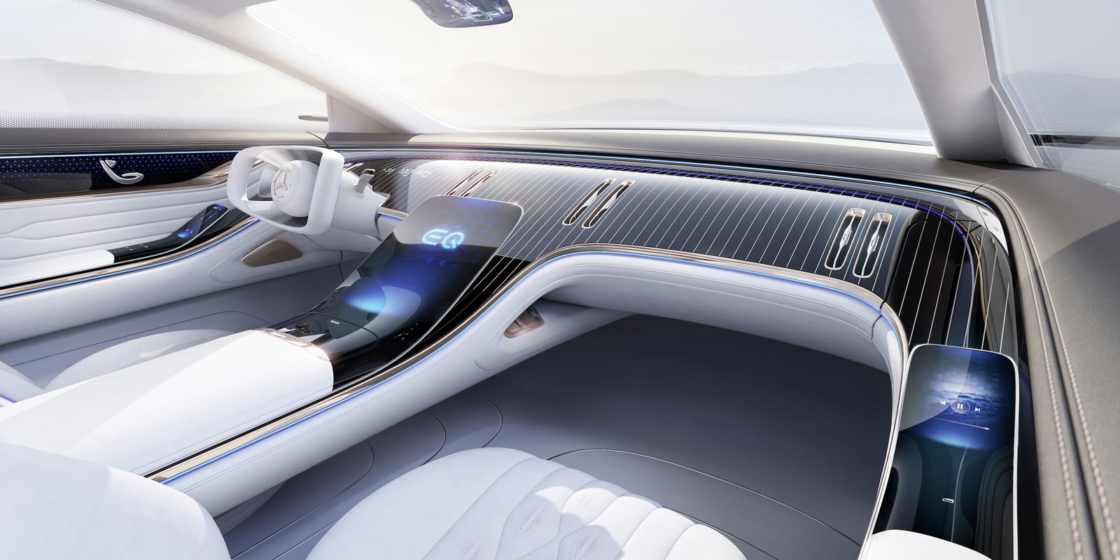
The main takeaway from yesterday’s bumper 2021 Mercedes S-Class leak wasn’t the exterior looks, although there’s still plenty to talk about there. No - the key focus was the enormous screen.
Mirroring a similar setup on the EQS concept, the giant central display sits on a diagonal plinth that sweeps up from the centre console. It’s significantly bigger than any other infotainment setup Mercedes has ever put in a production car, and now - once again via CocheSpias on Instagram - we can have a closer look at the unit.
Along the bottom portion of the screen are all the climate controls, which we suspect will remain there regardless of whatever other functions you might be using on the display. Physical buttons are extremely limited - we can make out an on/off switch, volume controls, a hazard light button and not a whole lot else along the strip at the base of the screen.
Also in the cabin, there are EQS concept-style vertical vents, and what looks to be the same design of steering wheel seen in the updated E-Class. On the outside, yesterday’s batch of images showed slimmer headlights, a bigger grille, and CLS-like triangular rear clusters.

Mercedes is expected to ditch the usual choice of wheelbases instead making it longer as standard. Power will come primarily from mild-hybrid inline-six diesels and petrols, with a meaty 4.0-litre twin-turbo AMG V8 expected to arrive at some stage. Against all odds, there will still be a twin-turbo V12 option, if the latest batch of rumours is to be believed.


Comments
the more i see the new W223, the more i realise that the current W222 will reach legendary status for years to come….
why?
Last Mercedes with a V12.
Best looking Mercedes in my opinion in years.
A bit techy but its focus is still pure luxury, and thats what differentiated it from its rivals which had way too many fancy tech. this new one looks to have way too many gimmicks as well. (that screen and steering wheel looks terrible ngl.)
Also in a market that heavily favors SUVs, the W222 single-handedly saved the luxury sedan market. Major props to that.
Ugly
Who at Mercedes signed off on those taillights? They don’t look good on the cla or cls why would they look good here?
Tbh as a Mercedes fan, it doesn’t really appeal to my taste.
Why did they have to copy Tesla’s huge Touchscreen?
I still miss the “push and rotary switch” from the old COMAND system, really easy to use and gave a good haptical feedback.
The exterior design is better than the sketch, but the grille size increasement has to stop right there. Dunno why the chinese market loves this on cars, imo it is just overdone.
Tail lights could be bigger and the steering wheel doesn’t really look good on first glance.
Conclusion: Everything itself is good, but the proportions (Screen and grille huge, tail lights and steering wheel center too small) are really messed up.
Only good thing is that W222 will be admired now and gets cheaper.
I am not the guy for this size class (would rather take C or E class), but whoever likes huge luxury sedans can be happy soon because he will get a used W222 for a reasonable price, and will have a wonderful, remarkable car. 😉
That’s one ugly car. I don’t know about you, but in my opinion Mercedes has completely lost it
To all the people who think that ths car is ugly, The only THING THAT IS UGLY ARE UR BRAINS BC U ARE NOT GETTING ACUSTTOMED TO THE FUTURE U BUCH OF GREASY EHADED T W A T KNUCKED SCUM BAGS. STOP JUDGING AND GET USED TOT HE FUTURE BC TIMES ARE CHANGING. THINK ABOUT IT IF THEY MADE CARS INT HE SAME TYLE AST HE PRESENT DAY THEY U WILL BE ALL BOGGED DOWN AS WELL AND THEY ARE NTO SO PLZ JUST SHUT UR GOBS. :(