Volvo’s Russian Doll Styling Is Somehow Dodging Flak - For Now

It’s hard when you’re called out on faults you hadn’t even realised you had. The other day Matt R and I were talking about car design when an uncomfortable truth came up. No, it wasn’t about our secret bromance, and it wasn’t even about my dubious taste in late-1990s dance music. It was that we’re both massive hypocrites and we didn’t even realise it until now.
Right here I can only speak for myself, and it’s time to make a confession. In the past I, like many other motoring hacks, have been vocal when it comes to car makers building a whole range of cars like Russian dolls; near-exact copies of one another but in sizes from tiny pupper to big dog. Audi and BMW have been there before, churning out products that, from most angles and at a glance, could be any one of three or four different cars.

It has always been a German trait. Porsche has a habit of building sports cars that look pretty similar from the front, but at least the Stuttgart brand’s excuse is that if they changed the face they copy and paste onto multiple models, they’d ruin it.
And yet this criticism of the likes of BMW has brought about two sets of consequences. Firstly, changes have been rung. New models from Munich are no longer identikit replicas of existing cars, but a size smaller or larger. In turn, that means some models are pretty and others are… well, a dog’s dinner.

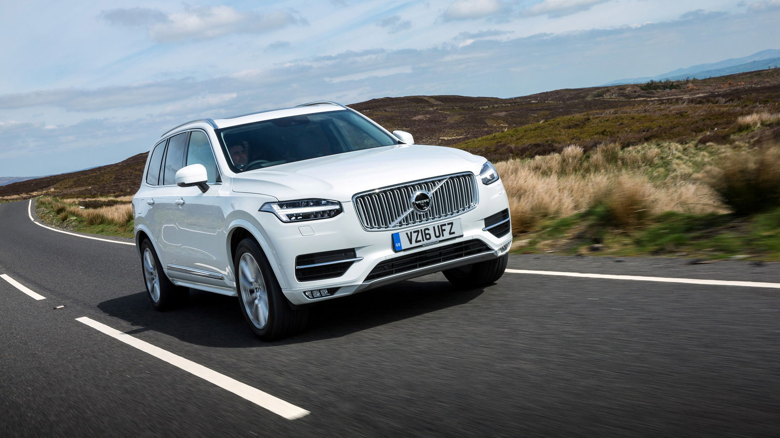
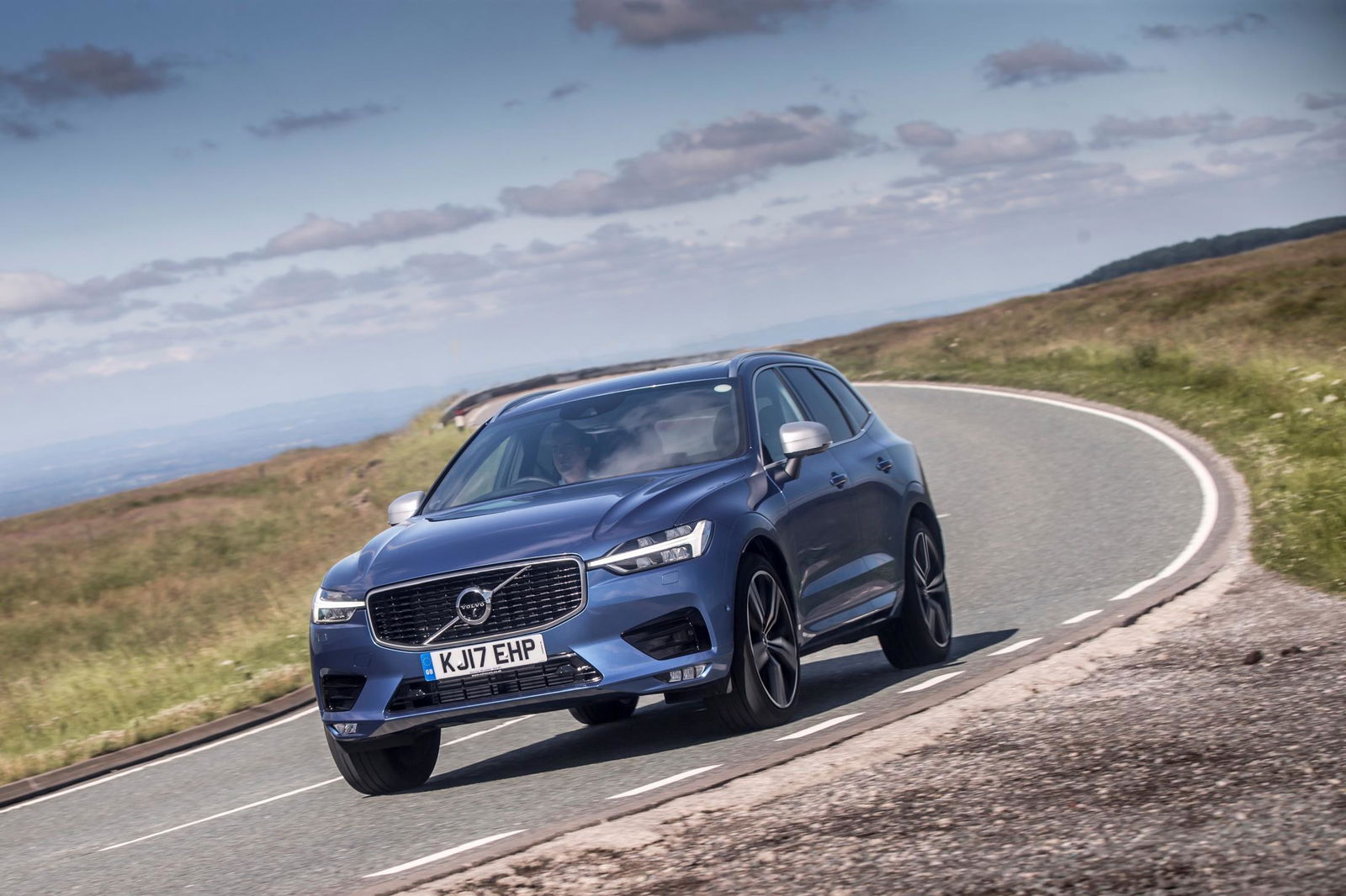
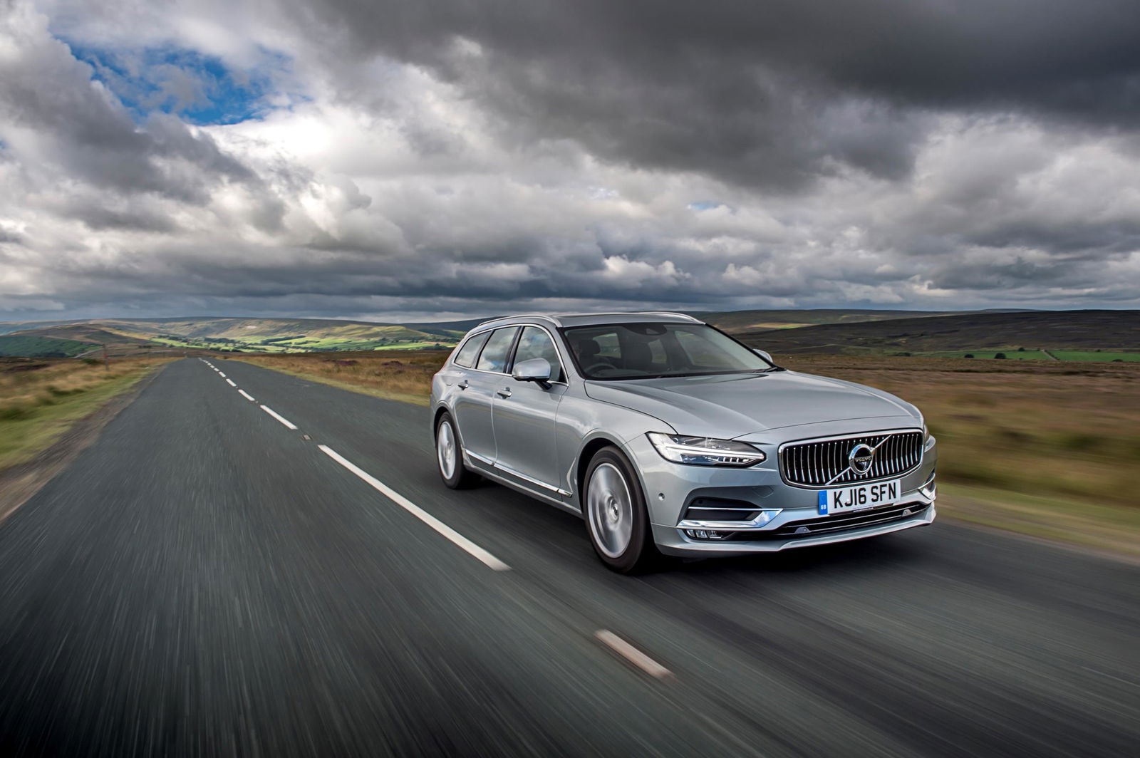
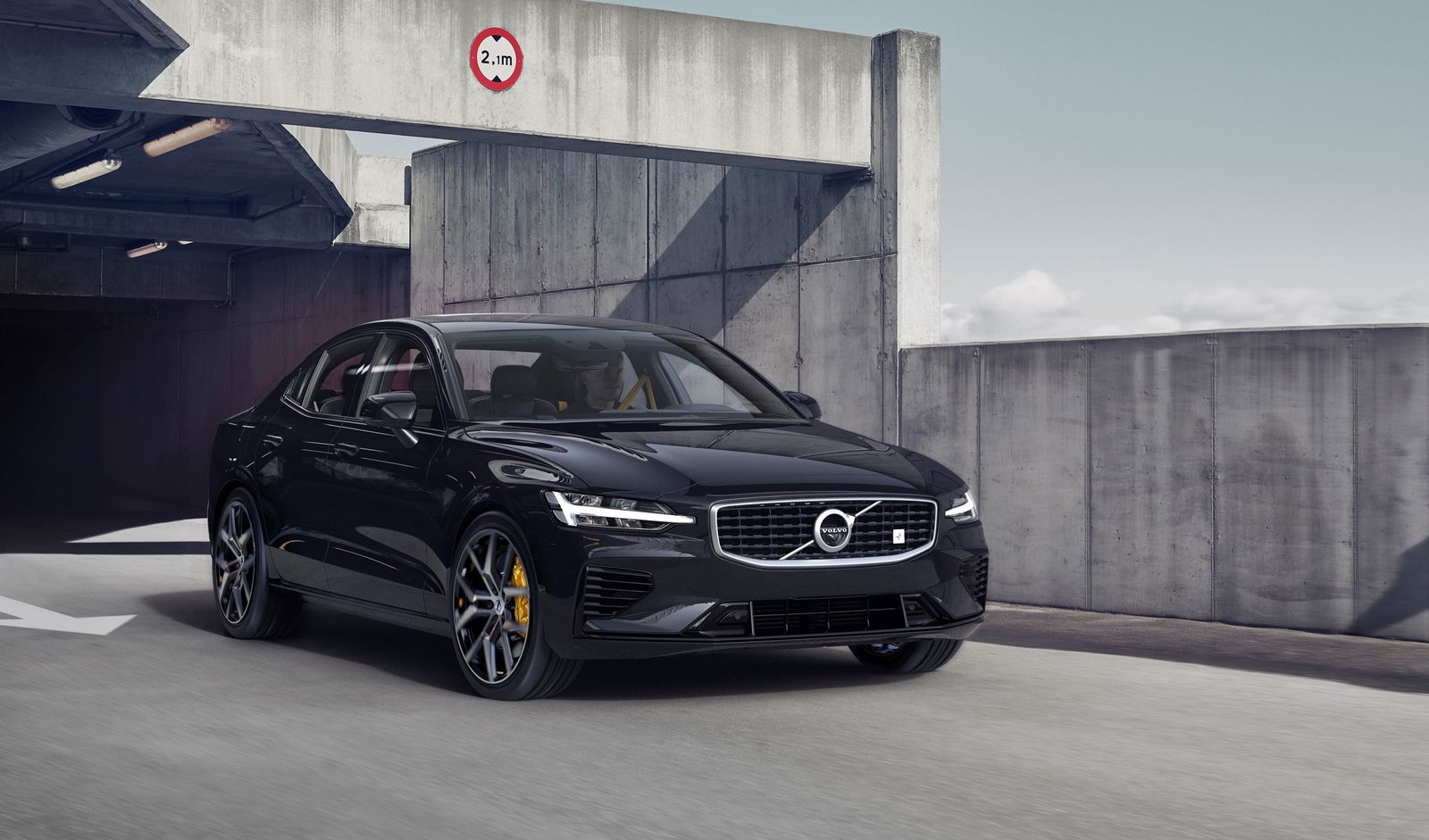
But closer to the heart of this confession is that we’re letting one manufacturer off. The public and media alike have given the Germans a kicking over the years for their lack of styling imagination, and yet we’ve not said a word about Volvo, which this week launched the new S60 (below), which looks like a shrunken S90. Then there’s the V60 which looks like a miniature V90 and the XC60… you can see where I’m going with this.
It was some years ago that the company management said to journalists that it wanted to create ‘iconic’ styling. Love it (like us) or loathe it, Volvo’s new era of penmanship sure is distinctive. Or, rather, it’s distinct from other brands. When it comes to distinguishing between in-house designs, especially from the front, it’s like playing spot the difference between the trimmed bushes either side of a stately home’s front door. There are differences, but you have to stare in order to see them.

Why aren’t we moaning about this? Maybe it’s just that we’re so pleased that Volvo has finally struck the kind of long-deserved success it has craved for decades. Maybe it’s that, if we’re honest, the latest Volvos are some of the nicest and most effective everyday cars you can buy. That kind of showing earns goodwill among car journos.
Let’s not forget that all this blossoming good press is still nice and new. The Russian doll effect hasn’t yet had time to fog the glass of Volvo’s rapidly expanding trophy cabinet, but, if things carry on the way they are, it will. People get bored; the look becomes showroom white noise.
Volvo’s mission to create styling that becomes famous, if not iconic, seems to involve building an entire generation of new models with more or less exactly the same face. If it doesn’t shake things up in different directions when facelift time comes around, copy-and-paste will come back to bite the brand – just as it did for the Germans.


Comments
I guess Volvo’s chinese owners don’t give enough cash for styling departament. That’s why all models look the same.
The problem is people, not Volvo. Today, a perfect car that is ugly, wouldn’t sell at all, while a total garbage of a car that looks nice would sell. Volvo doesn’t want to risk creating something unpopular, afterall, they are smaller than their rivals.
The v90 is is the best looking estate on the market right now, I think they’re right to Russian doll that design.
To be honest, I think Volvo has nailed the styling department better than any other manufacturer. All of their cars look good (something rare right now), are all very clearly Volvos, so what’s he problem? They are genuinely the only car company in the world that doesn’t sell any minging cars right now.
It’s the Aston Martin approach: if it ain’t broke, don’t fix it
Imo I don’t mind
Firstly, its better for the companies - amongst economies of scale effect (which hopefully means lower costs and better quality for us) there are other benefits, such as for their brand as they have an easily recognisable design
Also, when you’re thinking of buying a 5-series you’re not looking at 3-series or 7-series
You’re also looking at the A6, E-class and S90
So as long as BMW/MB/Audi/Volvo look different, thats ok
Secondly, for me personally, I’d rather base my decision on what size and price car I need, not “I have to get the S90 because the S60 is ugly” - especially for Volvo who found a truly beautiful design language
For now
inb4 next post: “Volvo’s New Design “Language” is Lazy, And Here’s Why”
The car manufacturers believe that they have to make any car in the lineup be more or less similar in order to increase brand recognition, but at the same time you would want the higher end model be somewhat distinct from the lower end models. It’s important to find a decent compromise between these two things.
But the Volvos don’t all look exactly the same, do they? While the 60-series and the 90-series look extremely similar (C-class/E-class likewise are extremely similar), the XC40 can be told apart from the XC60 and XC90 . I think they are doing the right thing for now. The XC40 is distinct from the XC60 but at the same time looks unmistakeable like a Volvo.
I laughed at the line that stated the two Matts are into ‘90s dance tunes - you guys are perfect for each other!! It’ll soon be more than a Bromance 😉😉
From my perspective what Volvo does is just being 2000’s Audi. As you can remember there was a time in Audi line-up when all models looked the same. Audi spokeperson when asked about this said that it’s because they want to create a brand image to make it more recognisable, to make people know the brand. That’s what Volvo is doing right now. They’re making them look the same to create a solid, kinda new brand image, to let people know that what they’re looking at is a Volvo not something else. I think their design language will evolve, change and I think we can see some interesting models in not-so-near future
Pagination