Yes, This Really Is The Leaked 2018 Mercedes-Benz CLS
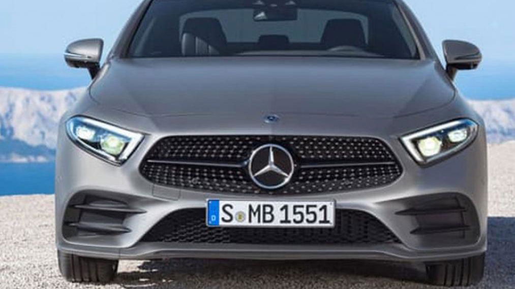
This is the all-new Mercedes-Benz CLS. We think. We’ve split-screened this and the old one and we’d swear it was just a facelift, but apparently we’d be wrong.
The images have been leaked by various social media channels (whoops) a day before its scheduled debut at the Los Angeles Motor Show.
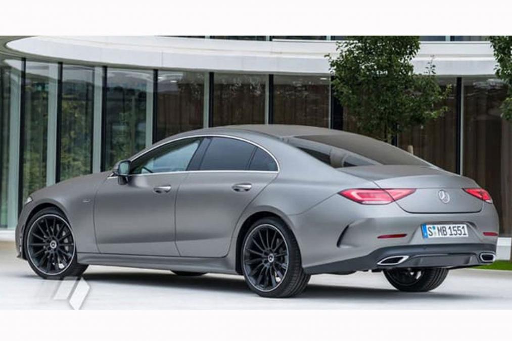
They’re low-res files, but we get our first full look at the front, the back and the interior, where we can see the same sort of ambient lighting line as we’ve already clocked in the new A-Class. Expect that to change colours, like the smaller car’s does.
Mercedes’ designers have pinched the outer edges of the single-unit headlights, making them more triangular than before. The silhouette must be more or less identical partly thanks to a roof line that involved some fine use of copy and paste.
The grille is still vaguely trapezoidal, but this time the wider part is at the bottom, giving the impression of a lower, schpordier nose. On the lower bumper the grille apertures are much the same shapes and sizes as before.
Changes are more significant at the back. The flat, horizontal upper line running across the tailgate is in keeping with Mercedes’ latest – and stoically Germanic – designs, while we can also see the kind of fake exhaust trims that we’ve moaned about more than once. It looks very aerodynamic, at least, to give the slippery shape its due.
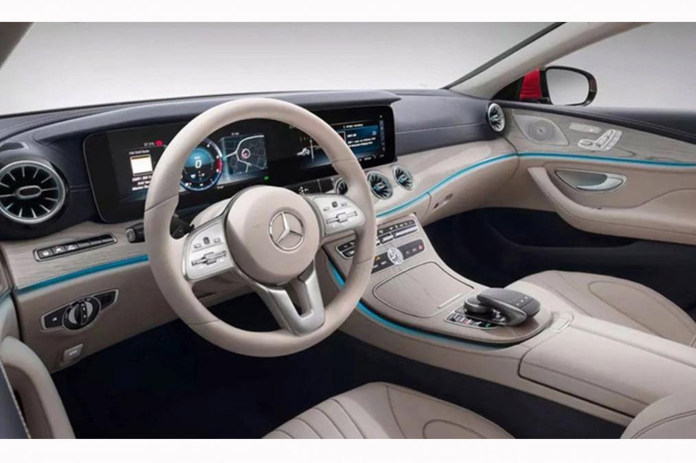
On the inside the two-tone leather interior of the example car is similar in its new design cues to the A-Class. Air vents that look like deeply-dished alloy wheels have illuminated strips just like the entry-level Benz does, while the displays are fully digital. The twin screens could be new 10.25-inch units or they could be 12.3-inch fatties like those we’ve seen used in higher-end Mercedes cars before.
Expect more technical details (and better pictures) to surface tomorrow, after the car’s official unveiling in LA.
Comments
The first cls was handsome, all the subsequent ones look bloated. Someone needs to fire Gorden Wagener.
No,that rear simply doesn’t look good on any Mercedes.
Since they decided to put plates on the bumper instead of trunk they just look kind of cheap…
Looks quite bad if I’m being honest
cries in german
HOW THE FUUCK DOES IT LOOK LIKE THE OLD ONE IT DOESN’T LOOK ANYTHING LIKE THE OLD ONE EXCEPT IN GENERAL SHAPE
Why is the car crying?
CLS was always my fav Merc, and I hate the fact that I’m the only one who thinks this one is perfect…
look
Wow I like it! Curves are a good change, Mercedes is going back to their roots with design. I think this will be a hit.
Might look better as it ages
Pagination