The Aston Martin Vantage Is A Bittersweet Revolution I Can't Love

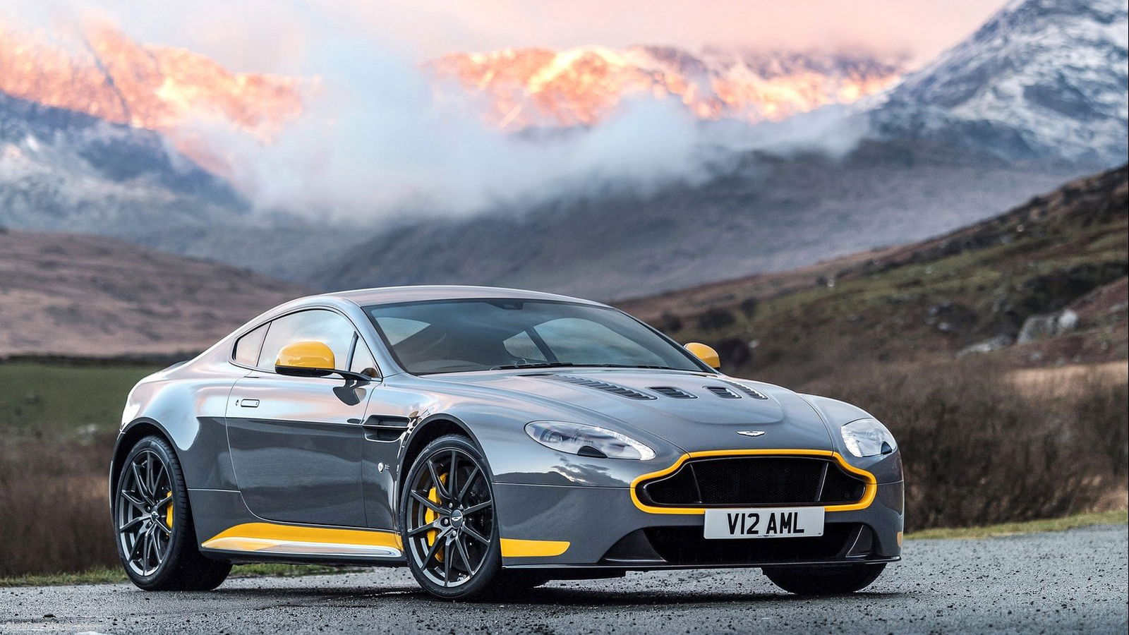
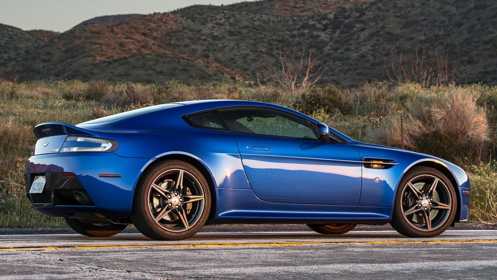
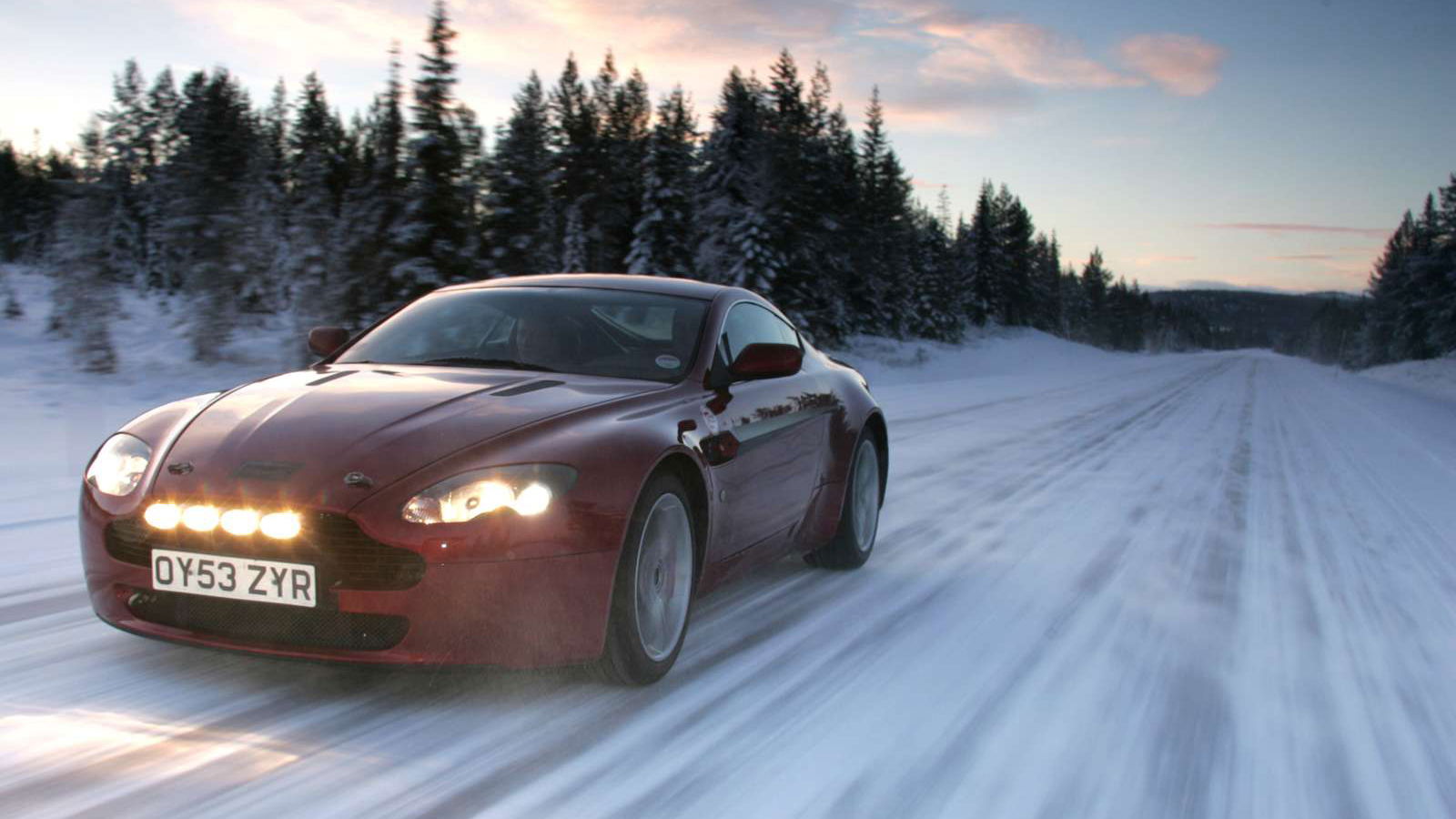
I love the old Aston Martin Vantage. It was never the fastest, the most exciting or the most exotic sports car on the planet, but it looked stunning and made an epic noise from both eight- and 12-cylinder normally-aspirated engines. That was enough.
It had a priceless combination of badge, performance and raw emotion; something that even Porsche has struggled for with ordinary 911s. Everyone loved the Vantage even if they wouldn’t buy one with their own money, while some people still say Stuttgart’s finest is a bit boring (totally untrue, but people have their opinions).

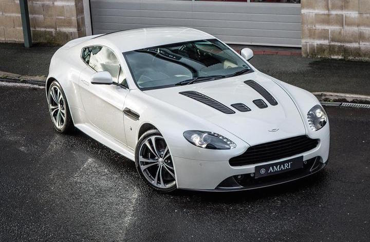
They loved it because of they way it looked. Small, totally neat from nose to tail and with just about perfect proportions, the Vantage was arguably the best-looking member of a family of supermodels, from the first model to the last. Whether you picked the more refined look of the V8 or the more muscular, angry-looking V12 with its bonnet vents and loud colour options, it was pretty much the most perfect piece of styling of modern times.
That presented Aston Martin with a problem. The DB9, whose design was started by Ian Callum and finished by Henrik Fisker, spawned the template that all subsequent Astons of the era had to follow. Arguably it was perfected with the tight, purposeful Vantage, but the family grew with the DBS, Rapide, Virage and the Vanquish, all of which looked so similar that the untrained eye wouldn’t know the difference. It had become too much of a good thing.

What do you do when you’ve had a perfect relationship but you feel like its time has run out? You just have to make a clean break, and that’s what Aston has done. It’s moving on, as the market effectively forces it to. Not even styling perfection can keep the buyers flowing in, if it fails to change with the times.
So things have changed. The new Vantage isn’t the standard-bearer; that honour went to the DB11 that preceded it by a good few months. The switch from Aston Martin V8 to AMG V8 has been well documented elsewhere so we won’t dwell on it here, but we will look at the styling. Because, on this car, it matters.

You might have noticed that it takes some pretty hefty cues from the DB10 concept we saw in the Bond movie Spectre. Actually, it’s the other way around. The future Vantage had already been designed in 2015, when the film was released, and the DB10 was based on that. It was a handy way of gauging public opinion with a good few years spare to change things up if needed.
The production car’s massive, ‘bottomless’ grille design is… different. The headlight shape, viewed face-on, is a little bland. The curves running from the sharp single leading edge all the way to the back corners of the bonnet are lovely and the car’s silhouette is straight out of the top-drawer, but this is a fundamentally less attractive car than its predecessor. By quite a lot, I’d say, although it’s always subjective and the new kid is hardly ugly.

Is the turbocharged engine good? Yes, by all accounts. Will it drive well? Again, no question. Does it make me desperately want a used one in the future? No. Sadly, no it doesn’t. I know the style revolution had to happen. The models needed to be differentiated more, and to Aston’s credit that seems to be what’s happening, but I’m just not in love with the new one. I’m supposed to be, and part of me knows that, but my mind, my eyes and my heart still belong to the one who came before.
Excuse me while I fire up the classifieds and ugly cry over my keyboard.


Comments
My sentiments exactly
Though the new Vantage is still undeniably Aston, it doesn’t seem as subtle, yet striking as the previous gen. The front looks a bit like they just had to add something, but couldn’t figure out what, so they just enlarged the grille, and the taillight that runs along the edge of the boot, in my opinion, it looks bad, not ugly, just bad.
Agree 110%
I know exactly what’s wrong. It’s the headlights.
Finally! I thought I was the only one
Two things:
Yes, headlights should be bigger and have not character, but if only one thing can be changed and make it look much better, it is the grille. Making the lights better and not changing the grille would still make it look stupid from the front.
Side and rear are amazing. Reminds me of Jag F-Type, but that’s OK, as the F is a gorgeous car.
7 manual option
Argument invalid
I think it just feels too… Chique. Too much like it’s a luxury car and not a supercar.
Still getting used to the grille and the headlights… love the rest of it though!
looks like its screaming in both anger and fright
Pagination